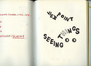
- This design was made by first drawing out the name, changing the ways the letters sit to mimic changing the way things are seen / seeing things differently. Eyes were then sketched out to try and incorporate them in to the logo.
- After scanning these in the letters were manipulated and then replaced with a similar but more rounded typeface.
- An illustration of an eye was found on google images and then edited on Photoshop to use in the designs. This contrast of bold rounded type and fine lined illustration compliment each other well in the logo.
- A dashed line was also experimented with to represent a scientific diagram, similar to a light prism. This demonstrates the concept of the exhibition - challenging and changing the way you see things / perspective.


No comments:
Post a Comment