Tuesday, 28 February 2017
OUGD603 / Food Stall Branding / Research 2
- While researching food stall designs and packaging I came across old popcorn and sweets packaging. This type of vintage packaging really interests me - I might base my design on this aesthetic as I haven't seen many eateries execute this style tastefully - mostly cupcake or milk-shake places pick up this vintage aesthetic but can look tacky.
OUGD603 / Food Stall Branding / Research
Firstly existing food stalls were looked at to see what's successful and what's not, the bright, bold designs work a lot better as the stall needs to be easily recognised and read from a far - also to stand out from its many competitors (if at a festival).
OUGD603 / Stop Motion Promo Video / Making The Model
This took a few hours to make, a small cigarette was made also as this is in some of the pictures of the octopus, he wears glasses as well which were made from wire.
OUGD603 / Food Stall Branding / Brief
Brief: To create the overall image for a new catering business. This business will be a pop up food stall appearing over festivals and other events.
The food stall is called 'Dips 'n' Shit' and will be selling a wide variety of dips with things to dip into them - crisps, breadsticks, wedges, chicken strips, etc...
The stall aims to be as ethical and sustainable as possible, using recycled cartons and napkins / cutlery.
OUGD603 / Stop Motion Promo Video / Brief
This is a brief I had not planned however when propositioned with the idea I found it very exciting - a night in Leeds called Soul Control uses an octopus as their image / identity. I will be making a stop motion video using an octopus made from plasticine to promote the night that they can post on social media.
This brief is in collaboration with someone external to the course (Soul Control). We will be making the plasticine octopus from scratch trying to replicate their version as closely as possible, then the octopus will put on a record and have a dance. This will all be done through stop motion.
This brief is in collaboration with someone external to the course (Soul Control). We will be making the plasticine octopus from scratch trying to replicate their version as closely as possible, then the octopus will put on a record and have a dance. This will all be done through stop motion.
Tuesday, 21 February 2017
OUGD603 / Research-led Brief / Ceramics / Glazed & Finished
The pots have now been glazed and fired. These are the finished outcomes - some worked successfully and some didn't, the copper oxide (dark green) didn't turn out the way I had hoped, it is darker than I imagined, also some of the cobalt carbonate (blue) smudged a bit making the painting look a bit messy.
Some of the overall look of these pots are a bit wonky, this is a result of me not centering the clay properly at the start of throwing. This is something I will work on on the next batch and have to keep practicing with.
OUGD603 / Exhibition / Distribution
These posters would be distributed just over a month in advance.
Monday, 20 February 2017
OUGD603 / Exhibition / Poster & Flyer Designs
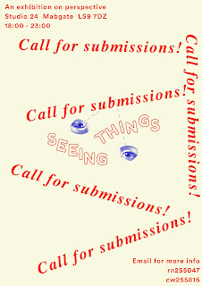
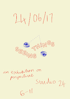
After asking for feedback on what designs were preferred these were the most popular.
Feedback (when asked why):
- use of space made it easier on the eye / more aesthetically pleasing
- focus on the logo which makes it more memorable
- the logo already has a lot going on so having the rest of the poster more simple creates a balance
Submissions poster:
Poster for exhibition:
Sunday, 19 February 2017
OUGD603 / Exhibition / Submissions Poster
Hand rendered type has been experimented with although after gathering feedback it became apparent that the last 3 designs were most popular. (Using Times, Times Italic and a sans serif typeface called Sporting Grotesque).
Saturday, 18 February 2017
OUGD603 / Exhibition / Poster Design Development - Feedback
- The 2nd design was popular although “big date distracts from the title of the exhibition” “perhaps this is good because it’s about seeing things”.
- The 1st design with hand written type was also popular.
- The 1st design, but make the logo bigger and the other text smaller
- 3rd design also preferred
Friday, 17 February 2017
OUGD603 / Website Design / Designing Layout
- WIX has been chosen to use for creating the website as I found there is less limitations on this compared to others like Square Space where there are set layouts instead.
- Times New Roman has been used to reflect the classicalness of the antiques. Karla (a sans serif typeface) has been used for the text underneath for legibility.
- The photo's that will be used haven't been sent to me yet so these are just stock photos until the others are sent.
OUGD603 / Exhibition / Final Branding Design
OUGD603 / Exhibition / Branding Design
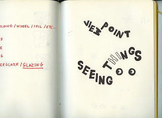
- This design was made by first drawing out the name, changing the ways the letters sit to mimic changing the way things are seen / seeing things differently. Eyes were then sketched out to try and incorporate them in to the logo.
- After scanning these in the letters were manipulated and then replaced with a similar but more rounded typeface.
- An illustration of an eye was found on google images and then edited on Photoshop to use in the designs. This contrast of bold rounded type and fine lined illustration compliment each other well in the logo.
- A dashed line was also experimented with to represent a scientific diagram, similar to a light prism. This demonstrates the concept of the exhibition - challenging and changing the way you see things / perspective.
Subscribe to:
Comments (Atom)


