Extended Practice

Thursday, 9 March 2017

OUGD603 / Food Stall Branding / Experiments

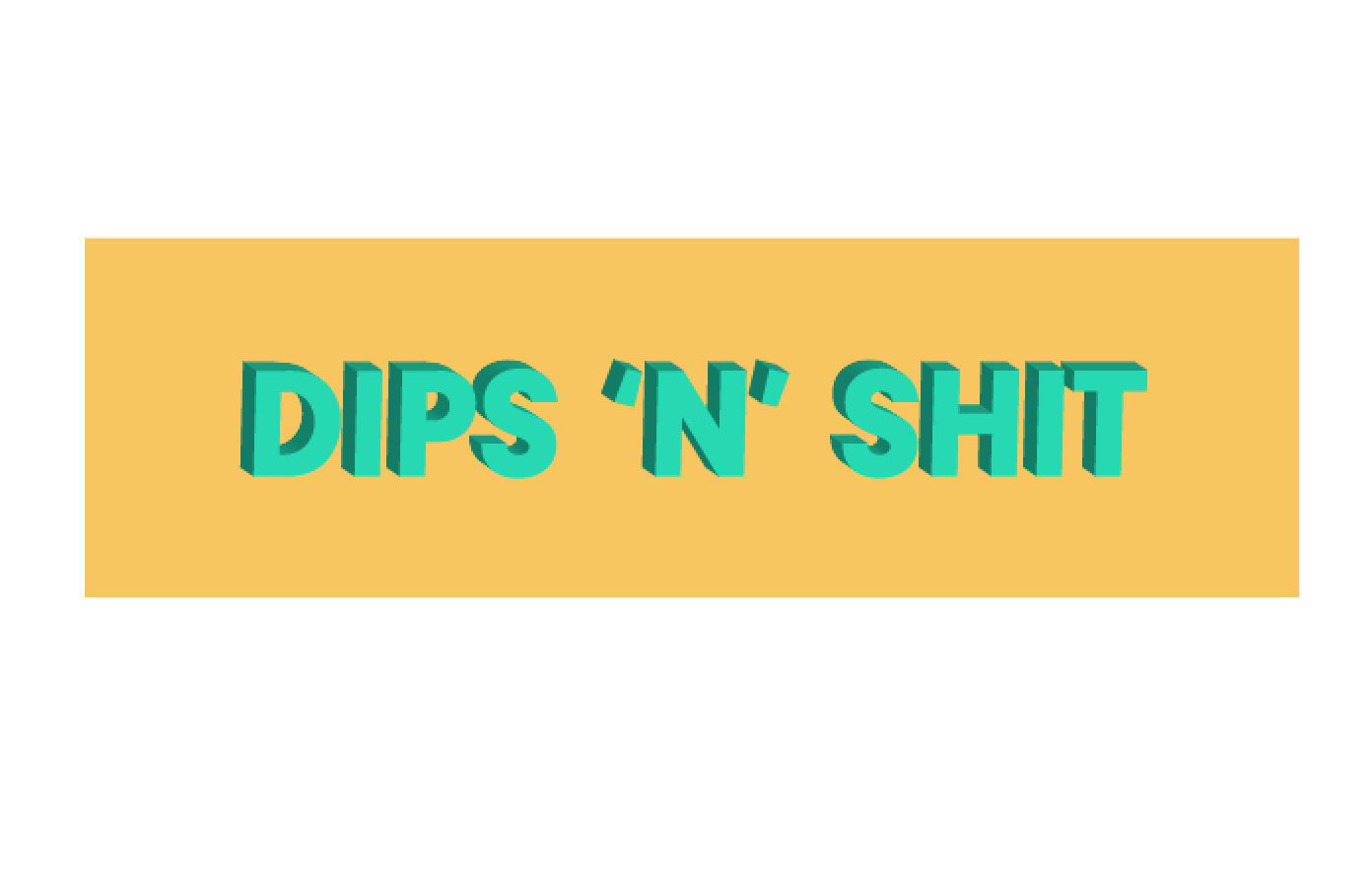
- I stated off by using a a simple sans serif typeface and distorting it on Illustrator.

- I then discovered the typeface Hobo, this type communicates the playfulness I want to get across in the designs.


Posted by Rya Nicholson at 06:15
Email ThisBlogThis!Share to XShare to FacebookShare to Pinterest
Labels: OUGD603

No comments:

Post a Comment

Newer Post Older Post Home
Subscribe to: Post Comments (Atom)
Rya Nicholson
View my complete profile

Blog Archive

  • ▼  2017 (106)
    • ►  May (33)
    • ►  April (26)
    • ▼  March (13)
      • OUGD603 / Moving Image / Food Waste Video / Plan
      • OUGD603 / Moving Image / Food Waste Video / The Re...
      • OUGD603 / Food Stall Branding / Design Development
      • OUGD603 / Food Stall Branding / Post Crit
      • OUGD603 / Moving Image / Food Waste Video / Research
      • OUGD603 / LUPE'S Cantina Rebrand / Research
      • OUGD603 / LUPE'S Cantina Rebrand / Brief
      • OUGD603 / Food Stall Branding / More Experiments &...
      • OUGD603 / Food Stall Branding / Experiments
      • OUGD603 / Food Stall Branding / Research 3
      • OUGD603 / Stop Motion Promo Video / Finished Video
      • OUGD603 / Research-led Brief / Ceramics / Photos
      • OUGD603 / Stop Motion Promo Video / Making The Video
    • ►  February (31)
    • ►  January (3)
  • ►  2016 (12)
    • ►  November (10)
    • ►  October (2)
Simple theme. Powered by Blogger.