Thursday, 17 November 2016

OUGD603 / Event Branding / Finished Designs


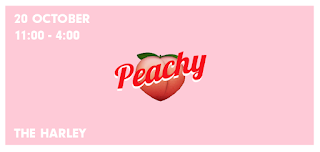
This was my interpretation of the final poster for the night - however after sending this to the client a few changed had to be made. They wanted the type that is vertical round the edges to be horizontal to read clearer, also to change around the rest of the information.

This is the poster after the clients requests:


Profile photo for the Facebook page:


Cover photo:


Actual event on Facebook:


Sticker:


The client is very happy with the finished design and has asked me to carry on with designing for the night as it progresses.


Tuesday, 15 November 2016

OUGD603 / Event Branding / Poster Design Development

The information was given to me that needed to appear on the poster. A mixture of hand-drawn type and digital type was tested however the digital type looked more professional and more clear it was for a club night. 


Friday, 11 November 2016

OUGD603 / Event Branding / Sticker Design

  • Stickers are required to spread awareness of the night, only the event name and the slogan is needed on them as they will be small so need to be simple. 
  • Bright colours were first experimented with however due to the limitations of CMYK they would be dulled. Therefore just the pink will be used and not the bright green.
  • The final design of the sticker was chosen by the client, this design is most simple and legible. 


Thursday, 10 November 2016

OUGD603 / Event Branding / Hand-Rendered Type

Hand rendered type has been scanned in to experiment with to give a more personal and unique appearance. 


Monday, 7 November 2016

OUGD603 / Event Branding / Digital Versions

Some other designs were experimented with digitally. I wanted to use the peach emoji but it looks bad quality so by pixelating it, it makes it appear purposefully bad quality instead. This also immitates the peach being a bum, like it has been censored. 

Bright neon colours have been used to make the design look fun and 'edgy' (what the client asked for).


Friday, 4 November 2016

OUGD603 / Event Branding / More Sketches

A lot of other sketches were done using pink highlighter as it adds brightness to the designs, however I was unaware that the fluorescent pigment doesn't come through when scanned. 


Thursday, 3 November 2016

OUGD603 / Event Branding / Sketches Scanned

After image tracing the scanned in sketches they have now turned in to vectors. A mock up was tested out in the form as a cover photo for the event on facebook however it looks very empty, this will fill up with more information I will need to put on - but I still think it looks too plain - it doesn't reflect the fun night.

I am going to sketch out more ideas and possibly just use the actual scan of the hand rendered image instead of vectorising it.


OUGD603 / Event Branding / Paco Perez Valencia

Paco Perez Valencia is a Spanish artist which I came across this summer in an art gallery in Spain, his works involves a lot of type and is a cross over of graphic design to fine art. 

When talking to the client they want the image for the night to very new and upcoming - 'edgy' was used to describe, this is why this artist sprang to mind, the images are very striking due to the bold bright colours and brush strokes. 


OUGD603 / Event Branding / Initial Ideas - Digital / Different Typefaces

These are a few initial experiments with different typefaces, here the actual emoji is being used, however I think these designs may look too girly due to the colours.


OUGD603 / Event Branding / Initial Ideas

The night will be called 'Peachy' - when talking to the client, they want the peach emoji to be used in the logo. 

I have started experimenting with digital variations of this and hand drawn -